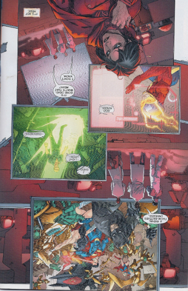
SPOILER WARNING: The following interview discusses specific events and plot points from “Batman: Death by Design”
With “Batman: Death By Design,” seminal graphic designer Chip Kidd lives out his childhood dream as the writer of his very own Batman story. Kidd, a life-long fan of Bob Kane’s creation, has worked extensively with DC Comics over the years, most recently designing covers for “All-Star Batman and Robin,” “All-Star Superman” and “Final Crisis.”
It was his turn as interviewer, in 2009 at 92Y, when Kidd joined Neil Gaiman on stage for a 90-minute discussion about “Sandman” in celebration of the landmark series’ 20th anniversary that led Kidd to writing the 104-page original graphic novel, which arrives in comic book stores on May 30.
Hearing Kidd’s unrestrained passion for Batman and comics in general during the candid conversation, DC Comics Co-Publisher, then DC Executive Editor, Dan DiDio offered him the project on the spot. Kidd, praying it wasn’t some kind of joke, agreed and started the process, in earnest, shortly thereafter.
Kidd, who is also credited as publication designer on “Death by Design,” joined forces with Mark Chiarello, DC’s award winning Vice President of Art Direction & Design, and British artist Dave Taylor (“Batman: Shadow of the Bat,” “Batman & Superman: World’s Finest”) to create a story Pulitzer Prize winner Michael Chabon (“The Amazing Adventures of Kavalier & Clay”) says “unites fandoms — comics, classic B&W films, architecture, design — like a conqueror unifying thrones.”
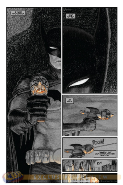
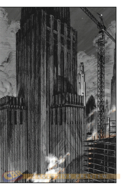
Set in the 1930s, “Death by Design” explores Gotham as it undergoes one of the most expansive construction booms in the city’s history. Inspired by two real world events — the demolition of the original Pennsylvania Station in 1963 and the fatal construction crane collapses in midtown Manhattan of 2008 — Kidd asks what if, despite the years separating the incidents, they were somehow connected? And what if they happened in Gotham City, during a glorious golden age when a caped crusader protected its streets?
CBR News: I won’t reveal how or why this question appears in “Death by Design” but what are you doing here?
Chip Kidd: [Laughs] I have been using that as the opening line in my lectures recently. Look, it’s a basic philosophical question that we could all ask ourselves every single day. It’s really about, “What are you accomplishing?” And “What are you going to leave behind?” Basically, “Are you doing something constructive with your life?” I forget why it occurred to me to include it in the book, but like I said, I think it’s something that we should constantly be asking ourselves.
You’re credited as the writer of “Death By Design,” but obviously you played a role in the book artistically, as well, as the publication designer. Can you describe your collaborations with Mark Chiarello and Dave Taylor?
Technically, I was the art director. I very much had a vision about how I wanted the whole thing to look and the milieu that it was supposed to be set. Mark Chiarello was amazing. He really stepped back and just let me go. He would then give suggestions, and almost always they were good suggestions. Even with a couple of the plot lines, he really helped out a lot.
For Dave Taylor, I would find visual references for the way I wanted it to look and I would send them to him. And he would send drawings back. That was our process. The overall look and feel of it, as I hope is evident, is supposed to look like the great, old 1930s’ Batman movie that was never made. Certainly, it is part Fritz Lang’s “Metropolis,” part Elia Kazan’s “On the Waterfront” and part “The Fountainhead” by Ayn Rand.
The good thing about not really knowing what you are doing is figuring out how to do it. There are many different ways to write a comic book script. For me, as a visual person, I wanted to give him basic page layouts, where I would break down how many panels were on a page and their configuration. For the most part, he was really cool with that because it did some of the work for him. And there were times he would suggest different layouts for very specific reasons and he was always right.
The book is heavily shaded in pencils, no inks, with only splashes of color throughout it to highlight certain scenes or specific characters. How did you land on these types of decisions?
Like I said, I wanted it to feel like a great, old black and white film from the mid-to-late 1930s. At first, I really strictly wanted it black and white, but Dave sent me some color suggestions, which were subtle things we could do to enhance the mood. The street lights of Gotham have this sort of peachy glow to them. During the day, the sunlight is kind of blue. Dave totally convinced me that it was the right way to go. It just gives you enough to take you in and out of day and night. And more importantly, I think it’s very beautiful. And it helps the narrative. It evolved over time. The whole thing is pencil on paper. He scans it in and then puts in some lighting and coloring effects. For Dave, it really was his show. It’s not like we had a penciler and an inker and a colorist. It was all him.
Part of the appeal of this project must have been developing the concepts for the new architecture of 1930s’ Gotham City. Highlights for me included the humpback whale inspired railway station and the mini-maximalist nightclub, known as The Ceiling —
A lot of that is me just having fun and becoming a fantasy architect. There is no such thing as mini-maximalism or maxi-minimalism, or at least not that I am aware of. Early on, Cyndia Syl praises the Wayne Central Station because it’s “the single best example of patri-monumental modernism in America.” And that’s also gobbledygook, fake architectural speak. It’s patri-monumental modernism as in his father built it. But while it was all fun, I consulted with a lot of architects who have built skyscrapers in New York City to find out what it takes to get something built. There is a lot of real stuff here too.
The Ceiling was one of the few ideas that I have been harboring for years. And I really wanted to see it in a Batman story. Again, it is like something you might find in a Busby Berkeley movie that never happened because it’s just too literally over the top. The whale station, again, that was Dave pulling one of his miracles. I wrote all that into the script, “Thousands of commuters, each day transformed into Jonah himself, swallowed by the leviathan of mass transitional vortex. Only to emerge again, spat out onto the very sidewalk of their destinations, their faith in a mobile society restored.” But Dave’s the one that had to figure out what that was going to look like. It was completely up to him.
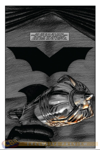
Batman is almost as famous for his gadgets as he is for his rogues. In this story, you were able to add a few new devices to the utility belt like the Grapple-Tron and the impact neutralizer. Does it get any better than that?
That was an incredible amount of fun. But I also wanted to invent a bunch of characters to put my personal stamp on the story, too. I loved this idea of a designer/villain who is not really a villain but more of a provocateur. He seems to come and go at will and how is he doing that? And why is he doing that? I think the best Batman villains work because you know why they are doing what they are doing. They have a reason for what they are doing.
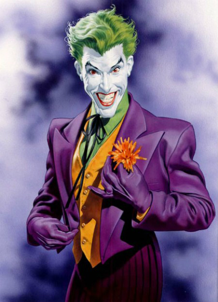
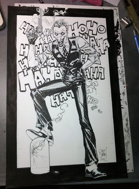
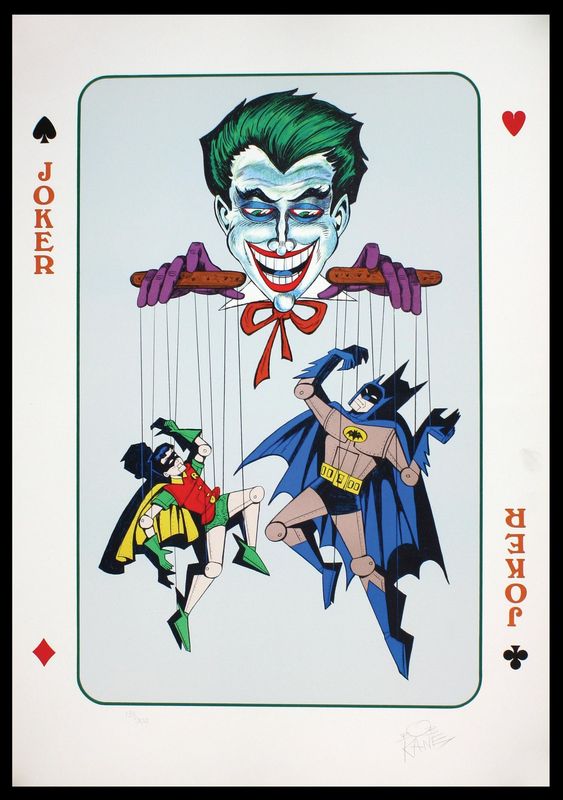
Originally, my outline and proposal did not have The Joker in it. Chiarello said, “This is fine, but don’t you want to use any of the classic villains?” I said, “Am I allowed to?” Because one does not assume. And he said, “Sure.” I thought, “I may never get this opportunity again,” so I had to go for The Joker. And then I had to figure out a reason for him to be there with the other characters. And then I couldn’t resist a cameo of the classic Penguin at the end. Who knows, if I had more pages, I may have had The Riddler in there, too. [Laughs]
Speaking of The Riddler, when “Death By Design” was first announced, you said you were approaching the project as a problem-solving exercise? Is that how Batman would do it ,or is that all Chip Kidd?
Everything is a design problem to me. Getting up in the morning is a design problem. [Laughs] Certainly, I wanted the story to be that too. I wanted it to be a classic mystery. Why is this happening? Why are the cranes coming down? Who is this Exacto person? I love the device of a reporter that is also trying to figure out. He’s a reporter that was really not intending to be assigned this story in the first place. He’s an architectural critic not an investigative reporter so that becomes an interesting situation too.
But again, I really wanted this to be a detective story. Obviously, you have to have — if you want it to be a successful Batman story — some sort of fisticuffs going on. You have to have an action element. The destruction of the building does seem inevitable. And I wasn’t going to shy away from that. But it’s not an ultra-violent rage fest either. That’s really not what I am interested in. I wanted something that looked at some of the more nuanced aspects of living in a big, major city in the 1930s that would have this character living in it too.
I highly enjoyed your take on Bruce Wayne/Batman as opposed to the brooding/sometimes psychotic Frank Miller-inspired Dark Knight version of the character that we so often see. Is this version your preference ,or were you simply more comfortable writing him in this style?
I was very conscious of that for several reasons. I love that in the very first original stories — from “Detective Comics” #27 up till #31 or #32, when Robin came on the scene — Batman was sort of like a gentleman adventurer. “My, my, you all seem very agitated that I’m here.” It was that sort of thing. I love the idea that Batman is to the manner born. He doesn’t hide the fact that he is a very well-born guy that, in his own weird way, has manners. In that way, Batman can look very elegant. In the penultimate scene at the end of the first half, he’s not this crazed, raged out guy, he is looking at getting to the bottom of what’s going on. At that point, it’s the union boss that completely freaks out and loses it. I also couldn’t resist the idea of getting caught in one’s own death trap. I think that’s a really fascinating concept.
I hope you or Dave Taylor don’t take offense to this either, but Batman is kind of pretty in this book, isn’t he?
I have no problem with that. He’s still masculine or what have you, but the Bruce Wayne look was based very much on classic Montgomery Clift in the films.
As we discuss the attractiveness of your leading men, Garnett Greenside is a pretty handsome guy, too, if not vaguely familiar —
Yes. [Laughs] But I don’t think he’s too handsome. I wrote myself into it. It’s that whole I may never get this kind of opportunity again, so therefore, I am going to put myself into it. And as the villain, no less.
Is Garnett Greenside the villain?
Not really. But he is willing to trick Bart Loar into basically killing himself. And if that’s going to take Batman and Richard Frank with him, then so be it. He’s very practical that way. I love the whole Batman I shall not kill. The moral code is great, and I think it creates many interesting instances of dramatic tension because you have all of these other characters that would just kill somebody if that’s what needs to happen. Actually, that’s the big problem that I have with a lot of the Marvel characters. With them, a moral code doesn’t seem to exist.
In that sense, it’s not that Exacto is really a villain, but he’ll do what needs to get done in order to arrive at the solution that he wants to arrive at.
I loved writing that scene where there is this back and forth between Batman and Exacto, where Batman ultimately says, “Think about what you are doing. It’s murder.” And Exacto says, “It’s not murder. It’s assisted suicide.” This guy set all this up and he’s trapped in it now. “I am just helping him kill himself.” Then Batman has the classic line: “He should be tried in a court of law.” And Exacto says, “No. They tried that already. He’d just buy his way out of it again. Or threaten to have the jurors’ children disappear or order the judge’s car blown up.”
To what extent does this vigilante thing go? I love that Batman/Bruce Wayne still believes that you can not willingly take a life in this way. You just don’t do that no matter what the other person did. In that sense, Batman sees Exacto as less of a villain and more as an adversary. But I think he would also be very intrigued by him.
I would like to think that if this story was to progress, you ultimately would get these Batman/Exacto team-ups where they would investigate various, different things. Exacto would get a little over his head, and Batman would have to save him. Or it would be the other way around.
That’s partly why Bruce Wayne hires him at the end. He thinks this guy is a really interesting mind and wants to pursue that.
“Death by Design” written by Chip Kidd with art by Dave Taylor, arrives May 30.
(article originally posted by Jeffrey Renaud at CBR HERE)
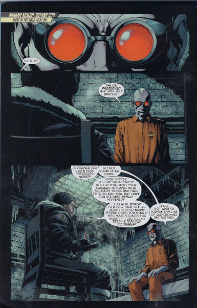
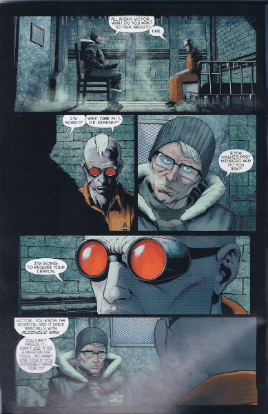
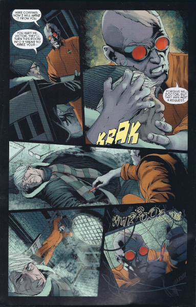
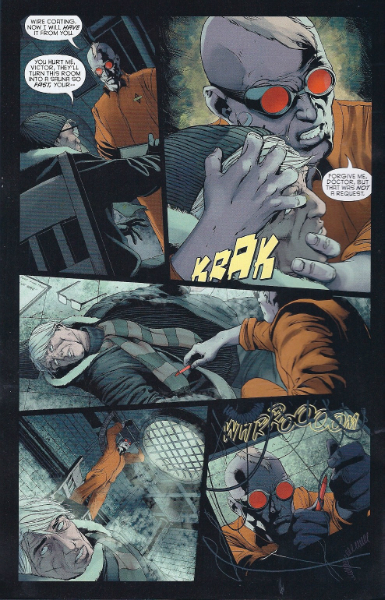
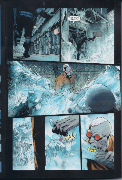
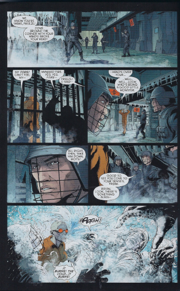
 This is a Joker-centric site, but the Clown Prince of Crime does not mind sharing his space in the net from time to time to bring you information on the wherabouts of other fellow villains; and so he has allowed me to share with you a short review on the re-introduction of Mr. Freeze to the New 52 universe.